BlizzCon 2011 Panel: Making of the "Black Soulstone" Cinematic
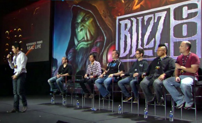
This Blizzcon 2011 panel featured seven members of the Blizzard cinematic team, as they exhaustively detailed the creation of The Black Soulstone cinematic, which debuted at the convention that year.
This article provides a full write-up of the panel, with extensive imagery from it. You can also watch the panel via the Diablo IncGamers YouTube channel.
There was a fair amount of new monster artwork shown during the panel, but as the content focused on the technical aspects of creating the cinematic, there was little new game or plot information revealed.
Contents
The Black Soulstone Panel[edit | edit source]
BlizzCon 2011 Cinematic Panel: The Black Soulstone Saturday, October 22, 2011, 3-4pm, Panel Stage
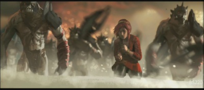
The panel began with a showing of the three-minute cinematic.
- See the Black Soulstone cinematic article for more information, screenshots, and analysis of the cinematic itself.
Watch the entire panel below:
After the cinematic concluded, the seven panelists came on stage. All are members of the Blizzard cinematics team, and none are Diablo III developers we've ever heard of before.
Storytelling[edit | edit source]
The first segment covers the importance of story in cinematics. They always begin with an idea that's pitched to the cinematic team. Everyone talks it over, agrees with the basic outline, and then it's worked out in rough storyboards. A number of simple drawings are presented, showing Leah at her candle-covered desk, looking at the soulstone, blinking, trying to think. It then cuts to the black scenery in hell with the thrones, etc. Very much like the finished movie.
The main emotion they tried to convey with this video was that Leah was terrified of these lesser evils and Azmodan. That's what they call a "story beat." Leah has to look afraid. So they work to convey that by her wide-eyed facial expression, her cowering body language, etc. That's the goal of all the cinematics guys. Modeler, programmer, animator, etc. All work together to create the story.
Color Choice[edit | edit source]
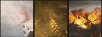
Pre-production artwork for the Black Soulstone. "The color script."
The director looks at all of the pics, sees color schemes that he can change as needed. They also provide a solid artistic reference for the artists. They wanted to create an intimate space for Leah and the black soulstone. The background is not important; all the focus is on Leah and the stone and the surrounding candles.
Once Leah is in the dream space, they wanted a vast, open space. A feeling for Leah that she's alone and helpless and isolated in this huge area. They used lots of low camera angles to emphasize her looking up at the towering Azmodan.
Once the cinematic moves outside to the armies and the volcano, we wanted a "hell on earth" scene. Saturated browns and contrast to the bright fiery tones.
The color script was pivotal for the production. Showing pics of the candles and Leah, then fading to the actual cinematic, showing how close they are to the final artwork. (Speaker is kind of killing time and treading water.) "Sometimes we stayed close to the original. Sometimes we changed. All depends on what was needed!" (No, really?)
Asset Development[edit | edit source]
They stress that they've been working on Diablo III for years, and that many of the characters evolved over time.
First version of Azmodan was very different. Like a human mask in front of a demon's face. Humanoid and not very large. Almost like a demonic version of an Angel. The writers were playing on the idea of a "mock angel" where the demon mimics the angelic form.
Over development he got larger and more demonic. He's the Lord of Sin. All forms of seven sins in one figure. Needed a much more complicated design. In another version, he was huge and warrior looking. Still humanoid, but with great cleaver weapons for hands, and a shark-like head with a long skeletal ponytail. Like a skinned shark. They thought this was a cool, scary version, but that it wasn't really the Lord of Sin.
It wasn't said in the panel, but it seems that this shark version was actually part of the Blizzard North version of Diablo III. The date on the concept art is August 2003, long before Blizzard North shut down in mid-2005, and the overall look of the finished shark, with the glistening bones and shark, clear lines is not like the painting-style of visuals in the current version of Diablo III.
Compare the shark to the Immolated Warrior and the Flayed Hound, monsters known to be from the early version of Diablo III.
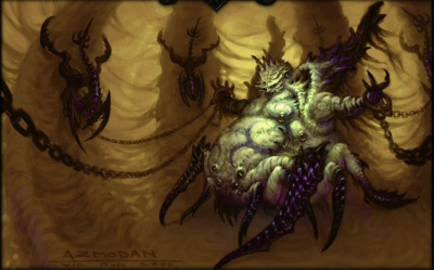
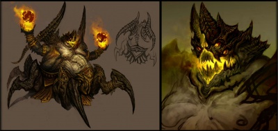
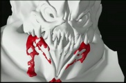
The final Azmodan concept is much different. A huge, bloated thing, chains, lots of legs, more like an insect. Swollen lumps on the body, very grotesque. White and pasty and oily looking.
More concepts. Back and forth between game team and cinematic team. Iterations! More final version for the cinematic, the chains are gone, the bulging body isn't as obvious, the face is more demonic and bizarre.
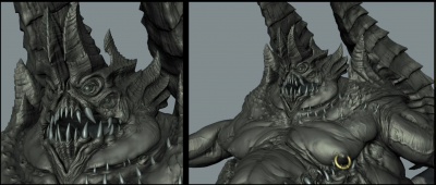
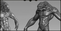
Next 3D model, used sculpting software like Mudbox and Z-Brush. Makes the design come alive in 3D.
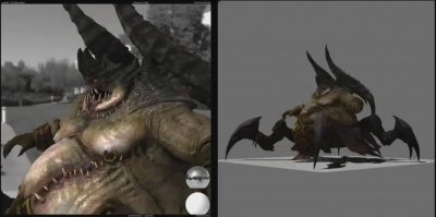
Next showing fully textured and colored version, spinning around for 3D view. Lighting, shadows, texture, all the tiny details. Lots of tweaking of shaders. Bone-looking wings, stitched body, etc.
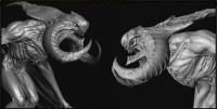
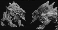
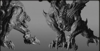
Demon army concepts. All heavily-armored by bone, teeth claws, etc. Many are quadrupeds, like alien lions. They usually use multiple artists for these, but they had such good designs from concept that all of the sculptors just took one and started running with it, spent two days on them and worked out numerous good demon designs.
Not all of the designs made it into the final cinematic, but they're all toothy and battle-ready in looks. Strong silhouette, great details... how to make more alive and scary?
Bringing the Art to Life[edit | edit source]
After they picked the designs, the art directors did paint-over. Left side shows the final "paint-over" for a demon. Colored, textured, etc. Lots of cuts and bruises and scars on their bodies, like they've been in battles. Want them to be intimidating and realistic. Must translate from 2D image to 3D model for game.
Far right is the final elite demon cinematic. With Blizzard campus in the background.
Next demon is a rhino/elephant type bulldog thing. Dry skin, with bloody fresh wounds. Odd to get textures right and contrast.
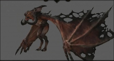
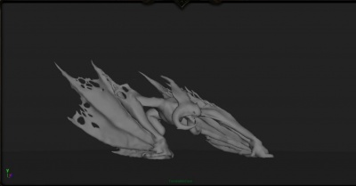
Next is the "winged demon." Very cool design, but you don't see much of him in the final cinematic. Hard to make the wings visible and visual. Make them detailed and different. Holes and tattered looking.
Effects[edit | edit source]
Mike talks about Effects. What you see on the screen is water, fire, atmosphere effects. Lots of effects. "Intrinsic character effects"
Lesser evils were always envisioned as "weeping smoke." We do a lot of other smaller character effects. Some things like Arthas' eyes in WoW. Steaming glowing smoke coming from blue eyes. Tychus, SC2 char with smoking cigar. Must e there, but not so blatant that it distracts from the story. Should be subtle and part of it, but not "bigger than life."
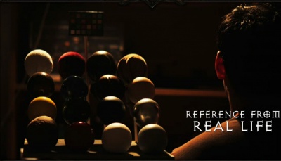
Reference from Real Life[edit | edit source]
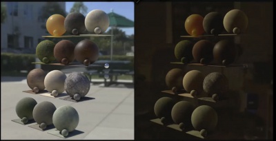
Steven talks about "pulling from real life." The Diablo universe is based on a very fantasy world. We tried to draw a lot of real life references in this cinematic. Skin references, to make flesh look right. Photo of lots of spheres with odd lighting, so they can study the lightning.
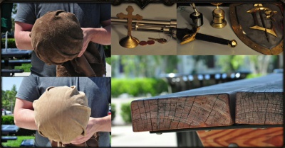
More photo references. Balls wrapped in leather, suede, see how the textures work and the folds. Used for Leah's vest and pants. Wood grain pictures, to get Leah's desk texture.
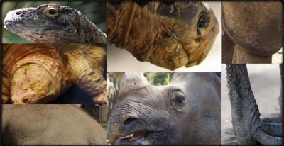
Lots of photos of iguanas, rhinos, horns, other animals, from San Diego Zoo. Surface details of animals, in close up high quality images. Useful for art directors.
Cool artwork of 12 balls, all with different textures. Spinning around with lighting changes and visuals.
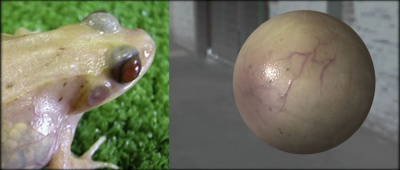
Weird shot of a transparent frog. Slimy, visible veins. Photos of amphibians galore. To model Azmodan's skin after it. They use many live references.
Leah[edit | edit source]
Shane talking. We did intensive studies from real life to model everything. From the beginning of the project, we knew the biggest challenge would be the super closeup shots of Leah. Face, eyes, etc. They've never done such super closeup of humans before, and it's a female, so they want her to look pretty. Also, the CGI must look believable.
The first thing was a photo session. Got their producer Angela, and set up the scene like that in real life. Candles, lighting, smoke, etc. Real photo on the right, cinematic on the left.
Close up photo of the eyes, the lighting, shading, gleaming reflections, etc. Capture high-res texture maps from real life, using a special camera rig.
(Poor Angela getting these super high quality photos of her with weird expressions.)
They took all the pictures and used them for reference throughout the production.
Broken work in progress render. How easy to get fake looking bad CGI. The final look is set up how the light hits on the surface, by the surface shaders. All must work perfectly together. The skin looks bad and fake and leathery in the screenshot.
Then they show the nearly finished version, much better. Took endless renders and tweaks to improve it. Worked on the lighting a great deal, to get all the little points of light of candles glowing in her eyes. They worked the assets directly with the lighters, to get the light, shading, and surface all perfectly integrated.
Lots of different views of the same image, with the skn tone changing and lighting, but the texture still doesn't look quite right.
They found that using soft light approach was very helpful. Makes the skin look much more realistic. They loved the first test render, and then mad everything to match it. Lots of small tweaks, keep making adjustments, even after the lightning was right they kept doing more and more. Displacements, subtle wrinkle movements, etc.
Animation Team[edit | edit source]
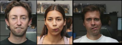
The animation team used photography to start. Took a bunch of photos of all the team making weird expressions. Gave them infinite expressions to use from models. And they took videos of close up faces, making eye expressions, blinking, rolling eyes, etc. As Leah does before she blacks out into the Azmodan sequence.
Human eye has numerous little half blinks and twitches and other subtle movements, and that researdh really paid off. They have to exaggerate it in the video to make it very clear.
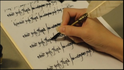
Leah's closeup hand shot. Filmed a woman's hand writing with a candle. How the pen indents the page, how the movement is, how the fingers hold, the shape of the hand, knuckles, wrinkles in the hand and skin, etc.
As animation studies anatomy, and others study lighting and models.
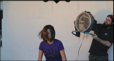
We simulate cloth and hair. We got one of Blizzard's female employee, Alison, who performs the sort of falling down to her knees motion Leah does. With a fan behind her watching how her hair moves and her body changes as she moves. The hair covers the face more than they expected.
Putting it on Screen[edit | edit source]
There's a lot of machinery and mechanisms and technology we use.
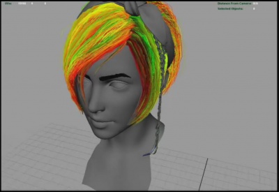
Leah's hair is down with a cloth simulator. How they try to compute all the hairs. Too many. So they do it with layers. Large clumps on top, individual strips further down towards the tips.
Show video of Leah falling to her knees repeatedly, with her hands over her face. All the layers to get her hair to look right.
Rigging[edit | edit source]
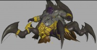
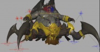
Digital puppet the animators use to make the animation. Skeleton of Azmodan, mesh gets added, controls on top of that. So the joints move appropriately, withlut having to animate every joint individually.
Azmodan is tricky since he's so large upper body, with crab legs. They have an amazing proprietary rigging system that lets them redo the designs repeatedly, as needed. Numerous controls on his legs, all the different joints. Lots on his face too, to control the jaw and mouth.
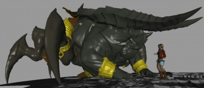
Complex movements. How he's all bent over to be on eye level with Leah. Not possible with his body. But they cheat to make it work. His upper body wouldn't fit that way, obviously when they zoom out. But it works in the close up.
Animation[edit | edit source]
Blizzard has the best animators in the world. They have these awesome rigs that the production tech made. But they've got to make Azmodan move believably. They look to nature to see how something moves. But Azmodan is an abomination; nothing in nature like him. So they pull from the best things they could.
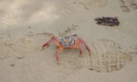
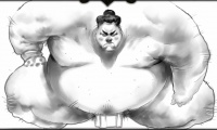
Video of a crab walking, for the lower legs. For the upper body they used sumo wrestler. He's like a sumo crab-man.
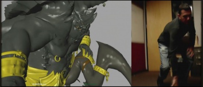
Video side by side of a human crawling around, rising up from hands and knees, to the standing. Make Azmodan movement labored, since he's so huge and heavy. They use the real person reference, even though he's slender.
The point of reference isn't to copy. It's inspiration that you should make something new from. Add in your own ideas to the video. Process it in the making of, and create something new that's never been seen before.
Video of Azmodan talking, with his bullfrog cheeks bulging out. And his weird double tongue flickering. First in a rough model, next in the final compared.
He has no lips. How does he speak without lips? They had to put something creative in to make a convincing voice. So they used the teeth and cheek movements to match the "lip" synch. It's unsettling when he talks and moves his weird mouth. Uneasy feel to it.
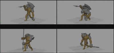
Video of the animation and walking of Azmodan's Army. Just countless numbers of chaotic, marching demons. A primordial mass that's coming out of the mountain. Demons walk very differently; some straight upright bipedal, others hunching more, dragging weapons, etc. They have some higher definition ones, "hero animations" near the camera.
Hi-def showing a winged demon walking with two legs and the long wings with claws on the tips.
Crowd animations[edit | edit source]
Jim: Diablo was the first game I'd play and just lose track of time. The game is all about slaughtering demons. Wanton murder of huge numbers of demons. They knew they had to have a shot with countless numbers of demons. And you get to kill them in the game, so all the better.
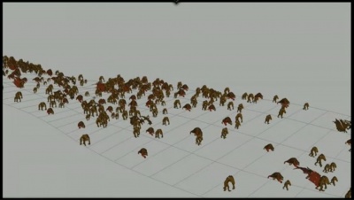
They made their valley, were worried they'd have to fill it entirely with demons. But with camera angles and such they only had to put a few trails of demons, with others further back just pixels moving.
Shot of a closer view, with director's notes. Change individual demon profiles, give some polearms instead of axes, for instance, to make a better silhouette. Only a few demons actually animated in front, but the background is a huge mass of movement, gives an illusion of more than they actually modeled and animated.
Character Effects[edit | edit source]
Mike speaking. One effect that didn't get into the cinematic. Azmodan was originally going to have constant drooling lava coming out of his mouth as he spoke. They show some animations for orange liquid running off or rocks. And an early take of Azmodan's bloody slobber on a plain model.
But as they did more tests it didn't look very good. How fast was the lava to flow? How far down the chest did it ooze? How about the continuity of the lava between shots? Lots of experimentation with the different styles of it.
Final concept drool has just a few tiny rivulets of glowing drool. They took it all the way to completion, but they began to wonder if it was just too distracting. Made Azmodan look sloppy or even comical. They didn't want that. So they removed the slobber. Added smoking eyes and mouth, glowing mouth thing, heat distortion, and that seemed to be enough.
Lighting Passes[edit | edit source]
Greg speaking. "As a lighter, I've got one of the best jobs in the place. Because I get to light everyone's awesome work." The main job of a lighter is to create light that supports the story.
The Black Soulstone was more realistic than most of their cinematics. Still very stylized, but basically realistic. In order to create realistic, lots of lighting tricks used that are seen in major motion pictures.
Lightning Leah[edit | edit source]
"Nobody looks good under a harsh spotlight."
They had to make some choices regarding the type of light sources they were using.
Hard light gets sharp shadows and crisp details. Soft light is more flattering. Depends on how big the light source is. They took some liberties with Leah, and combined elements from hard with soft.
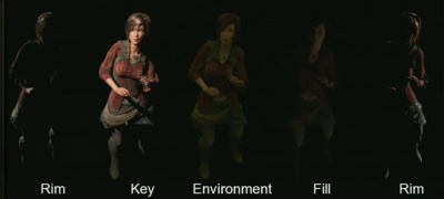
Lots of layers in lighting. Lighting passes. Rim, Key, Environment, Fill, and Rim. They can render each lighting pass separately, and add them all together to create the final result. Can then tint each one to a different color and intensity. Cool video shows varied color changes.
Render elements. The various components of the shot. Sometimes must separate to get it to work or to have more control over the layers. Azmodan, Leah, smoke, background, etc. All different pieces in the shot have to be put together at once, all lighted separately.
Render Elements[edit | edit source]
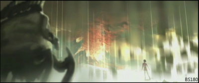
Graham talking. About the wall destruction shot. Concept arts showing the wall crumbling and the army beyond it. Wanted it all in one shot, to have great detail. Goes from a dark interior to the exterior vista of the monster army on the volcano.
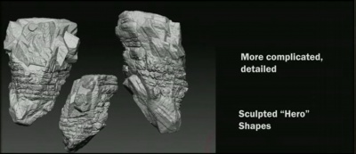
Very challenging to remove the whole wall. "Voronoi." A type of noise that's used in production. Turns a scattered wall of lights into a shattered glass sort of visual. They combine all the individual shapes to create more organic pieces that look more realistic. The crumbling wall is almost all hand animated, rather than a simulation. (Must have taken forever.)
Once they had the wall mostly done, they went back to the animators and did more work on the textures and models for the individual pieces. Many layers. Particle points and dust. The tiny rocks; more than 40,000 of them. Then smoke and dust. All fitting over the background, and the characters in the front, and more dust and haze for atmosphere.
These panelists are a small representative of the bliz cinematics team, lots more people, and they're really looking forward to everyone seeing the Diablo cinematics.
Question and Answer Session[edit | edit source]
The panel concluded with about ten minutes of time left for audience questions. A considerable number of them were from people who identified themselves as aspiring filmmakers, showing a lot of professional interest in this topic.
The first question was a semi-joking request for Blizzard to start including short films as bonus features, the way most CGI film DVDs are released with a bonus short movie.
While the question was joking, the reply was very serious: We don't have time for it, it sounds fun, etc. We've gotten better and working faster, but perhaps in the future we can start taking on and producing more work. (This will never happen.)
The next questioner asked if Blizzard has ever considered going back to their earlier, less-technologically advanced cinematics and remaking them. Such as the ones from Warcraft 2, or Starcraft 1.
The slightly-joking reply again gets a very serious answer, as the panel talks about how busy they are with new work. One does mention that he loves the Starcraft 1 cinematics, visually-primitive though they are.
The third question comes from an environment artist, who asks how often they spend the time and effort to put in full details on objects that aren't entirely seen on screen.
The reply is that they're getting better about not wasting time on that sort of unnecessary effort. They've realized that it's just not feasible to do full animation on everything, so now they make sure the main visuals in front of the viewer are high res and perfect, and they incorporate more "smoke and mirrors" elsewhere. For instance, in the opening scene of the Black Soulstone cinematic, with Leah at the candle-covered desk, they started to create a full bookcase type background behind her, before realizing the important element was her at the desk, and that they could just use a matte painting for the shadowy background.
The fourth questioner praised the Black Soulstone cinematic as the best he'd ever seen for a video game. His question was based on it, and he said that the visuals of armies of demons pouring down past a volcano reminded him of scenes from the Lord of the Rings films. And he asked if that was a specific influence.
The answer was that it's hard to not have some similarities to Lord of the Rings these days, when doing fantasy work of this scale. The panel went on to stress that they have numerous inspirations and influences, from art to architecture to films to other games, and that while LotR was surely some kind of inspiration, they did not craft that scene as any kind of intentional homage.
| Blizzard Entertainment & other Game-related Topics [e] Blizz Games Other Games Terms Devs Blizz ppl D3 D2 D1 Other ppl Events Merchandise Related |
|---|
| Blizzard's Games |
|
|---|
| Game Developers |
|---|
| Blizzard People |
Blizzard's Top |
Blizzard All |
Blizzard All cont. |
Ex-Blizzard |
|---|
| Diablo II Team |
|---|
| Diablo I Team |
|---|
| Industry People |
|---|
| Diablo Merchandise |
|
|
|
|
|---|
