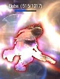
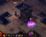
Red target outline
The Red Target Outline is a glowing border around monsters that helps the player see what they're targeting on the busy screens of Diablo III. It has been something of a controversial feature since some players feel that the line is too bright/thick and distracting.
Over time the feature has become generally-accepted, and by and large most players find it useful. However, the question has surfaced post release. [1]
- Any chance we will get the gauntlet cursor back as an option? And an option to turn off the red target outline? Avushb
Contents
Blizzcon 2009 DebutEdit
One of the surprise controversies of Blizzcon 2009 was the red target outline. A new feature just added to the game was a glowing red outline around the monster being pointed at. This outline was meant to help players identify what they were pointing at on the frequently-crowded and chaotic battle screens of Diablo 3. Most players didn't mind or didn't even notice while playing at the show, but for some at Blizzcon, and for many others viewing screenshots and gameplay movies over the Internet, the red outline was bright and too obvious and distracting.
This became a minor issue of contention, but the D3 Team is very strongly behind the inclusion of the feature, as Jay Wilson made quite clear during an October, 2009 interview. [2]
October 2009 InterviewEdit
Julian Love also commented on this, in October 2009. [3]
- DS:' while talking to some of the artists when visiting Blizzard HQ during Blizzcon they weren't too sure about the red outline on the mobs or bad guys whenever you mouse over them. Can you talk about that or any of other changes you've made since Blizzcon in direct reference to the feedback you received from fans?
August 2010 UpdateEdit
Community Manager, Bashiok, answered a few questions about the RTE in forum posts on August 19, 2010.[4]
Right now, if you disable it there’s still a faint red rim light used to communicate focus. I’ll have to follow up, hopefully I didn’t just say something incorrect… But I believe the intent is to default to the more apparent outline, and allow people to toggle it if they prefer a more subtle approach.
...it’s weird how things stick out in screenshots and while you’re playing it totally just doesn’t even occur to you with so many things going on at once. Which is why I think it’s a useful tool. I can be watching my health meter closely and be able to see I’m targeting something in my peripheral.Blizzcon 2010Edit
The red target outline remained in the game as of October 2010, at Blizzcon. Fans who played with it in the game had kind things to say about it, both in looks and function. A quote from Blascid's hands-on play report: [5]
- Was there even a red target outline on targeted enemies? You know, I do not even remember; hmm... okay-okay, now I do, yes, there was, and no, it did not stick out at all. Trust me, in the midst of a chaotic battle, you will WANT the red outline there, you will be worshiping it--maybe to even have it thicker, I know I will. It did not take me out of the game at all. I too hated it in screenshots, you will get over it, quick. Combat is very smooth. Like others have said in previous years, “Very polished.”
This issue continues to be a controversy (or a non-troversy) almost entirely based on how it looks in screenshots and gameplay movies, rather than in the game, where no one seems to object to its look or function. As more fans get their chance to play the game, the number of people objecting to it seems likely to decline further.
In any event, the D3 Team likes the feature and hasn't said anything about removing it, other than perhaps allowing toggle on/off option.
PvP Arena GamesEdit
The PvP Arena system debuted at Blizzcon 2010, and in still shots and game play movies from the Arena. In those the red target outline is more visible than in PvM visuals, and the shots touched off new debate. [6] You can see a few stills taken from the 2010 gameplay movie in the gallery below.
Red Outline Inspiration?Edit
Blizzard has not commented on the occasional allegations that they got this concept from the 1980s Ready Brek commercials. An example screenshot can be seen to the side... you decide!
- Ready Brek ad.
- Lots more of them on YouTube.
ReferencesEdit
- ↑ Toggle option? - Jay Wilson, Blizzard, 01/12/2012
- ↑ IncGamer's Interview - Jay Wilson, 16/102/2010
- ↑ Interview with Diabo-Source - Julian Love, 28/10/2009
- ↑ Dimmable Outline - Community Manager, Blizzard, 19/08/2010
- ↑ Hands on report - Blascid, IncGamers Forums, 25/10/2010
- ↑ Red Outline displays in PvP - Community, IncGamers, 23/10/2010


