Difference between revisions of "Inventory"
| Line 4: | Line 4: | ||
| − | ==Inventory | + | ==Inventory Features== |
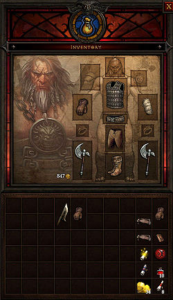
| − | [[File:Inv-aug-2010.jpg|thumb|250px|Inventory semi-final | + | [[File:Inv-aug-2010.jpg|thumb|250px|Inventory semi-final, August 2010. The large space on the left is open since an unnamed interface element was removed in that build.]] |
| − | The inventory | + | The inventory layout has evolved steadily during Diablo 3's development, with the general layout varying slightly, and the individual features changing a lot. See the full comparison image further down this page for a side by side look at the evolution. |
| − | The | + | The current, near-final[http://diablo.incgamers.com/blog/comments/jay-wilson-interview-pcgames.de/] version of the Inventory is simpler in design, and has much more room for items than most of the earlier versions did. The D3 Team played around with the different options quite a bit, experimenting with packs to increase the number of slots, tabs to hold different items (quest items and runes had their own tabs at one point), and many changes to the [[paper doll]] portion of the display. |
| − | The | + | The location of the [[Talisman]] has changed in every build as well. In the current, August 2010 version, it will be displayed on the left side of the window, beside the paper doll. This is an improvement in design over earlier versions, where the Talisman was only seen as a tiny icon, which had to be clicked to open a new window, in which it displayed at full size. |
| − | + | The way items display in the inventory has changed over time as well. The earliest revealed version of the Inventory had items that all took up one space each, with the number of spaces determined by the size of the [[Adventurer's Pack]] the character had equipped. In the current, semi-final version, all clothing and weapons take up two spaces, standing taller than they are wide. Smaller items, such as [[scrolls]], [[runestones]], and [[gems]], take up just one space, and most such items stack. | |
| − | |||
| − | ===How Fast to Fill?=== | + | ===How Fast to Fill Up?=== |
| − | + | This has varied with the different designs of the inventory window. The current design has the largest inventory yet, with space for several dozen items, plus numerous smaller objects. This huge space, along with the newly-revealed [[Salvage Cube]] makes it seem like players will very seldom need to return to town just because their inventory is full. | |
| − | + | This is intentionally, as the developers of Diablo 3 have included numerous features to make regular town returns unnecessary. Salvaging, [[Artisans]] who work on projects while the character is not in town, the [[Scroll of Wealth]], the removal of [[Town Portals]], and more. Once you enter the dungeons in Diablo III, you are intended to stay there for some time. | |
| − | |||
| − | |||
| − | |||
| − | |||
| Line 32: | Line 27: | ||
The basic inventory and paper doll design seem fairly set, though the details continue to change. | The basic inventory and paper doll design seem fairly set, though the details continue to change. | ||
| − | The [[paper doll]] is on top, with shoulders and | + | The [[paper doll]] is on top, with [[shoulders]], [[pants]], and [[bracers]] added to the item slots we saw in Diablo II. |
Below the paper doll is the inventory grid, which has repeatedly changed in form and function. One feature returning from Diablo II is the [[gold]] counter, with the amount of coin a character is carrying shown numerically, and no inventory space required to hold the money. | Below the paper doll is the inventory grid, which has repeatedly changed in form and function. One feature returning from Diablo II is the [[gold]] counter, with the amount of coin a character is carrying shown numerically, and no inventory space required to hold the money. | ||
| − | One thing the designers have stressed is their desire to fit in a lot of inventory storage, while keeping the items large enough for players to appreciate the graphics. | + | One thing the designers have stressed is their desire to fit in a lot of inventory storage, while keeping the items large enough for players to appreciate the graphics. They've tried a lot of different ways to do this, including a feature that caused items to enlarge when hovered over, and multiple inventory tabs so the items in each tab could be larger and more visible. |
| − | |||
| − | |||
There are no [[charm]]s in Diablo III, and as far as is known, no other items that force a trade-off between storage space and bonus stats. | There are no [[charm]]s in Diablo III, and as far as is known, no other items that force a trade-off between storage space and bonus stats. | ||
| Line 75: | Line 68: | ||
::'''Mike: '''Oh yeah, very much so. | ::'''Mike: '''Oh yeah, very much so. | ||
| − | |||
| + | ==Gallery== | ||
<gallery> | <gallery> | ||
Revision as of 14:13, 8 September 2010
A character's Inventory is the menu page that shows the Paper Doll with currently-equipped Items, and the inventory where spare items are stored. The inventory system has changed a great deal from how it functioned in Diablo II, and Diablo III's inventory has changed many times during the game's development.
That process seems to be near an end though, as Jay Wilson confirmed [1] in August 2010 that the current look is near final, and that it had not changed in the last half year of development.
Contents
Inventory Features
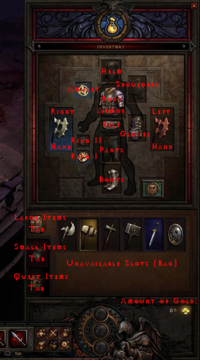
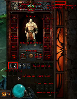
The inventory layout has evolved steadily during Diablo 3's development, with the general layout varying slightly, and the individual features changing a lot. See the full comparison image further down this page for a side by side look at the evolution.
The current, near-final[2] version of the Inventory is simpler in design, and has much more room for items than most of the earlier versions did. The D3 Team played around with the different options quite a bit, experimenting with packs to increase the number of slots, tabs to hold different items (quest items and runes had their own tabs at one point), and many changes to the paper doll portion of the display.
The location of the Talisman has changed in every build as well. In the current, August 2010 version, it will be displayed on the left side of the window, beside the paper doll. This is an improvement in design over earlier versions, where the Talisman was only seen as a tiny icon, which had to be clicked to open a new window, in which it displayed at full size.
The way items display in the inventory has changed over time as well. The earliest revealed version of the Inventory had items that all took up one space each, with the number of spaces determined by the size of the Adventurer's Pack the character had equipped. In the current, semi-final version, all clothing and weapons take up two spaces, standing taller than they are wide. Smaller items, such as scrolls, runestones, and gems, take up just one space, and most such items stack.
How Fast to Fill Up?
This has varied with the different designs of the inventory window. The current design has the largest inventory yet, with space for several dozen items, plus numerous smaller objects. This huge space, along with the newly-revealed Salvage Cube makes it seem like players will very seldom need to return to town just because their inventory is full.
This is intentionally, as the developers of Diablo 3 have included numerous features to make regular town returns unnecessary. Salvaging, Artisans who work on projects while the character is not in town, the Scroll of Wealth, the removal of Town Portals, and more. Once you enter the dungeons in Diablo III, you are intended to stay there for some time.
Inventory Layout
The basic inventory and paper doll design seem fairly set, though the details continue to change.
The paper doll is on top, with shoulders, pants, and bracers added to the item slots we saw in Diablo II.
Below the paper doll is the inventory grid, which has repeatedly changed in form and function. One feature returning from Diablo II is the gold counter, with the amount of coin a character is carrying shown numerically, and no inventory space required to hold the money.
One thing the designers have stressed is their desire to fit in a lot of inventory storage, while keeping the items large enough for players to appreciate the graphics. They've tried a lot of different ways to do this, including a feature that caused items to enlarge when hovered over, and multiple inventory tabs so the items in each tab could be larger and more visible.
There are no charms in Diablo III, and as far as is known, no other items that force a trade-off between storage space and bonus stats.
Stash
The D3 Team has promised that we'll see a much larger town Stash in Diablo III. They've also said the stash will allow easy item transfers between characters on the same account.
Since no specifics or screenshots of the stash have yet been revealed, we can only take them at their word.
Development
During WWI 2008 and BlizzCon 2008, the inventory was similar to that of World of WarCraft, with one slot for each item, and a possibility to expand the inventory space by adding up to four bags to your character. Smaller items also stacked up to five in a stack in order to save space. It started with 12 slots, but could progressively be upgraded to 30 slots.
This system was simplified over time, and as of August 2009 there's only one bag slot, but it can add a great deal more space to the default character's inventory.
The evolution of the Inventory was discussed during Blizzcast #8, in March 2009. [3]
- Bashiok: Since people saw the game at BlizzCon, the interface and the UI has actually changed dramatically.. ...What are the changes that have come about since then?
- Mike: Well one of the biggest things involved in Diablo are items, right? We’ve experimented with a few things and one of the big things that everyone liked from Diablo, as an entity, were the large objects right. While it was more efficient to go with a WoW style one size fits all icon, which is what most people have seen, we really wanted to see what we could do and so we went back and reevaluated the system and we’ve decided split it into large and small objects. That brings up the question of Tetris inventory all over again, and a lot of people are opposed to that, some people like it, some people don’t. So what we did we ended up tabbing the inventory, so now you have your large items, and then you have a tab for small items, and there’s a third tab for quest items. That way all the items can coexist nicely with each other without the frustration, which w as one of the complaints about the old system is the frustration in trying to fit everything into your pack.
- Bashiok: And are we still going to see the bag system coming back, the expandable [inventory] with the bags, or is it a set inventory size for each tab?
- Mike: Current design right now is to have bags. You’ll get bags and they will expand, you know kind of like in WoW, except you’re not going to open up separate windows. You’ll start off your inventory with say… you know, eight slots, right, and then you’ll get a new bag and that has ten, so two more slots will open up within that tab, but you’ll never have multiple tabs. Like you won’t have two or three “large” tabs.
- Bashiok: Right, and is that working out pretty well so far? It’s been in testing for a while.
- Mike: Yeah, most people seem to really like it. I mean the feedback has been pretty good, personally I love it, because it lets you do both, it lets you have the large icons but it eliminates the frustration that people voiced about having different sized items within your inventory.
- Bashiok: And you can really see the artwork as it is now with the larger icons...
- Mike: Oh yeah, very much so.
Gallery


