Difference between revisions of "Fanmade:Behind the Fiery Runes"
(→Sketches and Concepts) |
(→Sketches and Concepts) |
||
| Line 99: | Line 99: | ||
==Sketches and Concepts== | ==Sketches and Concepts== | ||
| − | With each new series, HK always drew his ideas out on paper to plan his next series. Same went for his nameplates especially when it came for the 3rd series nameplate. | + | With each new series, HK always drew his ideas out on paper to plan his next series. Same went for his nameplates especially when it came for the 3rd series nameplate. He had such a crazy idea for that nameplate that he drew a rather large image to convey his idea, so he wouldn’t lose the very idea he planned for. |
| − | |||
| − | |||
| − | He had such a crazy idea for that nameplate that he drew a rather large image to convey his idea, so he wouldn’t lose the very idea he planned for. | ||
Revision as of 23:02, 15 February 2009
The is a behind the scenes look at Holyknight3000's series and how he made it to be.
Contents
Introduction
This was the Fiery Runes Series by Holyknight3000, the popular wallpaper series that was started on diablofans.com and moved to the galleries of diii.net.
Background
The Fanart:Fiery Runes Series was created by Holyknight3000 two weeks after the announcement of Diablo 3
Behind the Runes
The series was made when HK was trying to experiment with some wallpaper he was making. His Cinematic Demon V2, wallpaper was suppose to have burning runes that were going to be on the 4 corners of the border but that was considered too flashy, but he thought it would be a neat idea to make the other 29 runes in the same fashion. So over the period of 10 days HK made each rune.
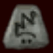
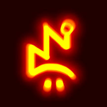
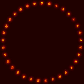
How he did it was simple, he used the old d2 runes from the Arreat Summit page, and created a new image layer, and started drawing on top of the old runes, as best he could. After he managed to draw the rune, he added a red glow, then copied and pasted the drawn rune again and colored it yellow, and did a glow blur. Then he used the Add effect that brightened the layer, giving the glow for the runes, and didn’t need to make an orange copy because the glow was so radiant.
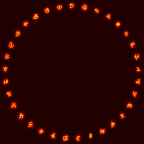
After he made those runes he used a graphics plug-in, to help him space them out into a nice circle fashion, and spaced out fairly evenly. Thus the runecircle was born.
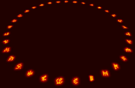
Not to long after the runecircle was made he used a 3d warp tool and made the runecircle like it was laying in a perspective angle so that anything could look like it was standing inside the circle. Thus creating the standard for what the series would be bound to using from there on.
Midway through the second series HK realized his old runecircle was getting fuzzy, blurry and really hard to see. So he chose to rebuild the runes again, and this time using the same methods from the first time making the runes. This time only blowing up the original rune images by 400 times the original size, to make them that much sharper.
As before HK zoomed out as he drew with his mouse the runes intricately and as best he could. The images when they were done were large enough on the wallpaper standards at the time for that series; as large as almost the full wallpaper.
These runes were also redone on a new runecircle, done with the same plug-in effect, but because the image was so large the plug-in messed up so HK had to manually enlarge the star effect. It took him 4 times to get the runes to match up in spacing to match closely enough to the old runecircle.
From there on HK used the new runecircle for the rest of his series.
Nameplates
The Nameplates for the Fiery Runes Series were a staple, an important part for the series. They added character to each series, helping people identify the series that they associated with.
Series one had a text only nameplate, that only had the name of the creature, blizzard’s name and Holyknight3000’s name below it. Then towards the end of that series he added his trademark icon that had the Zod, and the smaller rune circle with it, below the text name plate.
[Series One Nameplate]
Series Two’s nameplate got a little more graphically oriented. This time it had a demon’s face in the top middle. Then some metallic and stonework, and a spot that looked like it was from the diablo3.com navigation bar for the spot for the creature’s name for the nameplate. Then at the bottom part of the nameplate had some fancy stonework that had the second series icon in the middle of that stonework, and Holyknight3000’s name below it. Blizzard’s name was also to the middle left and the Diablo 3 logo was at the middle right.
[Series Two Nameplate]
Series Three had a much more sophisticated design that the others. It was Holyknight3000’s masterpiece. Everything he wanted for a nameplate for the series he managed to get it. Had to take using Adobe Photoshop CS3 to help get the bars separated for him to use. This nameplate he also made parts of it from scratch; the middle reddish gem, the left and right triangle wings, and the revision of the Series Three icon for this series. He also made larger and clearer Blizzard and Diablo 3 logos as well for this nameplate.
[Series Three Nameplate]
The iPhone series also had a new change. The previous three walls had series one and series two nameplates shank down for them. This time around HK created a more unique nameplate for the iPhone series. This one was simple yet can almost look like series three’s style, but the triangle bars the placement of the logo from apple. It was all from scratch to give a more unique feel. The apple logo was an added touch because it was for the iPhone. HK also reused the small rune circle from the series three nameplate for this one to add that fiery rune feel to it.
[Series iPhone Nameplate]
Sketches and Concepts
With each new series, HK always drew his ideas out on paper to plan his next series. Same went for his nameplates especially when it came for the 3rd series nameplate. He had such a crazy idea for that nameplate that he drew a rather large image to convey his idea, so he wouldn’t lose the very idea he planned for.
[Sketch of Series three nameplate]
Same went for the iPhone as well. This one was much easier to pen out since it was to be much smaller. HK wanted it to have the same feel as the 3rd series but wanted it to be more unique. So he penned it similar with the triangle side wings, and added the apple logo to give it that iPhone feel, and the rune circle to seal the deal.
[Sketch of the iPhone Nameplate]
References
| This article is a stub because it's in progress. Help by expanding it. |


